Midwest Excellence? Comparing mean test scores, students from Midwestern and mid-Southern states seem to excel at the SAT. However, these states generally have lower participation rates compared to other states. The higher scores are most likely attributable to participation rates as students from these states more frequently take the ACT.
Sunday, April 18, 2010
Final Project: U.S. SAT Scores and Participation
The displayed map was created as the final project for the University of West Florida Online GIS Certification program class, Cartographic Skills, (GIS 3015/L). The map was composed using ArcGIS ArcMap software and finished in Adobe Illustrator.
 Midwest Excellence? Comparing mean test scores, students from Midwestern and mid-Southern states seem to excel at the SAT. However, these states generally have lower participation rates compared to other states. The higher scores are most likely attributable to participation rates as students from these states more frequently take the ACT.
Midwest Excellence? Comparing mean test scores, students from Midwestern and mid-Southern states seem to excel at the SAT. However, these states generally have lower participation rates compared to other states. The higher scores are most likely attributable to participation rates as students from these states more frequently take the ACT.

Tuesday, April 6, 2010
Module 11 - Google Earth
The displayed map was created as part of the University of West Florida Online GIS Certification program class, Cartographic Skills, (GIS 3015/L) for the Week 11 lab exercise: Google Maps. The map was composed using Google Earth to identify and add an annotated placemark for a proposed wind farm location in the Great Lakes region. Screen shots were captured to create the main and inset images which were saved into the Microsoft Paint program then exported as a PNG file. The PNG file was imported into Adobe Illustrator(CS4) for finishing.

Lake Erie-Ashtabula-Conneaut Wind Farm
Justifications for Lake Erie-Ashtabula-Conneaut Offshore Site
An Ohio location was desirable due to Ohio's overwhelming public support for wind farms as noted by Green Energy and multiple other studies.
The specific site was chosen based on NOAA National Data Buoy Center data for the Conneaut Break Water Light buoy (CBLO1) showing an average annual wind speed falling within 5 (minimum working speed) - 15 (full capacity speed) meters per second for an average annual percentage of 56% of measuring events (an event had an average duration of 11 hours). This was the highest average rate of any of the buoy stations on Lake Erie in Ohio.
After searching for land-based sites near to the water and not finding any that seemed suitable, the idea of locating the wind farm offshore seemed like the more feasible possibility. Research online revealed the Great Lakes Wind Energy Center (GLWEC) Feasibility Study - Final Feasibility Report which stated among other things that Lake Erie presented the best Wind Resource in Ohio. Further research turned up the Wind Turbine Placement Favorability analysis which seemed to indicate that a site with a buffer of between 4-5 miles from shore midway between Ashtabula and Conneaut, presented only moderate limiting factors as a wind farm site. The chosen location is within shipping lanes and is actually in close proximity to the Cleveland Electric Illuminating Company - Ashtabula Power Plant, a potential electrical grid-connection point. The 4-5 mile buffer is far enough to mitigate any adverse affects due to noise, shadow flicker and visual impacts.
With regard to wildlife, European studies show that most waterfowl and seabirds detour short distances around wind farms so the proposed site is unlikely to significantly affect migrating birds along the one migration pathway that crosses through the site location. Also, based on European studies, habitat loss (i.e. foraging ground) should be minimal due to the distance offshore of the farm. Additionally, according to the GLWEC Final Feasibility Report, long term, it is possible that the foundation structures will actually create favorable marine habitat similar to artificial reefs found in the ocean.
While the site has some risk factors involved it actually seems to be a better location then sites that are in current consideration around the city of Cleveland.

Lake Erie-Ashtabula-Conneaut Wind Farm
Justifications for Lake Erie-Ashtabula-Conneaut Offshore Site
An Ohio location was desirable due to Ohio's overwhelming public support for wind farms as noted by Green Energy and multiple other studies.
The specific site was chosen based on NOAA National Data Buoy Center data for the Conneaut Break Water Light buoy (CBLO1) showing an average annual wind speed falling within 5 (minimum working speed) - 15 (full capacity speed) meters per second for an average annual percentage of 56% of measuring events (an event had an average duration of 11 hours). This was the highest average rate of any of the buoy stations on Lake Erie in Ohio.
After searching for land-based sites near to the water and not finding any that seemed suitable, the idea of locating the wind farm offshore seemed like the more feasible possibility. Research online revealed the Great Lakes Wind Energy Center (GLWEC) Feasibility Study - Final Feasibility Report which stated among other things that Lake Erie presented the best Wind Resource in Ohio. Further research turned up the Wind Turbine Placement Favorability analysis which seemed to indicate that a site with a buffer of between 4-5 miles from shore midway between Ashtabula and Conneaut, presented only moderate limiting factors as a wind farm site. The chosen location is within shipping lanes and is actually in close proximity to the Cleveland Electric Illuminating Company - Ashtabula Power Plant, a potential electrical grid-connection point. The 4-5 mile buffer is far enough to mitigate any adverse affects due to noise, shadow flicker and visual impacts.
With regard to wildlife, European studies show that most waterfowl and seabirds detour short distances around wind farms so the proposed site is unlikely to significantly affect migrating birds along the one migration pathway that crosses through the site location. Also, based on European studies, habitat loss (i.e. foraging ground) should be minimal due to the distance offshore of the farm. Additionally, according to the GLWEC Final Feasibility Report, long term, it is possible that the foundation structures will actually create favorable marine habitat similar to artificial reefs found in the ocean.
While the site has some risk factors involved it actually seems to be a better location then sites that are in current consideration around the city of Cleveland.
Tuesday, March 30, 2010
Module 10 - Isopleth Maps
The displayed map was created as part of the University of West Florida Online GIS Certification program class, Cartographic Skills, (GIS 3015/L) for the Week 10 lab exercise: Isopleth Maps. The map was designed using Adobe Illustrator (CS4).

The map was created by manually interpolating points for the contour line between various data points that were overlaid on the map and then hidden when the final map was produced. For some points, I eyeballed it when, for example, the contour point was about halfway between the points. At other times I used a calculator and ruler to figure out a proportional close approximation.
The contours were drawn in CS4 using the Pen tool then smoothed out using the smooth tool which really was the workhorse tool in making the map because it allowed me to get nicely-smoothed continuous contour lines. So the process was Pen tool - click-a-point, click-a-point then Smooth tool - smooth the curve, smooth the curve, smooth the curve, until the contour looked like the end result. Actually the process was pretty fun.
Finally, the question of whether to fill in the space between the contours came up. I looked at various labor intensive ways of doing so, even going so far as to color the first two contours in the upper right part of the map. However, I did not like the way they looked compared to how the map looks without the shading which allowed me to concentrate the effect of figure ground by using a gray fill to frame the state map. When I darkened that fill slightly, I could really see the contour lines stand out. My big concern was what to do with the empty space but as solutions I shortened up the bottom white area below the neatline and then placed my legend info in the triangular area in the Northeast quadrant of the map. In the end I am quite satisfied with the map.

The map was created by manually interpolating points for the contour line between various data points that were overlaid on the map and then hidden when the final map was produced. For some points, I eyeballed it when, for example, the contour point was about halfway between the points. At other times I used a calculator and ruler to figure out a proportional close approximation.
The contours were drawn in CS4 using the Pen tool then smoothed out using the smooth tool which really was the workhorse tool in making the map because it allowed me to get nicely-smoothed continuous contour lines. So the process was Pen tool - click-a-point, click-a-point then Smooth tool - smooth the curve, smooth the curve, smooth the curve, until the contour looked like the end result. Actually the process was pretty fun.
Finally, the question of whether to fill in the space between the contours came up. I looked at various labor intensive ways of doing so, even going so far as to color the first two contours in the upper right part of the map. However, I did not like the way they looked compared to how the map looks without the shading which allowed me to concentrate the effect of figure ground by using a gray fill to frame the state map. When I darkened that fill slightly, I could really see the contour lines stand out. My big concern was what to do with the empty space but as solutions I shortened up the bottom white area below the neatline and then placed my legend info in the triangular area in the Northeast quadrant of the map. In the end I am quite satisfied with the map.
Sunday, March 21, 2010
Module 9: Flow Maps
The displayed map was created as part of the University of West Florida Online GIS Certification program class, Cartographic Skills, (GIS 3015/L) for the Week 9 lab exercise: Flow Maps. The map was generated using ESRI ArcGIS - ArcMap and then exported to Adobe Illustrator (CS4) for editing and thematic elements.
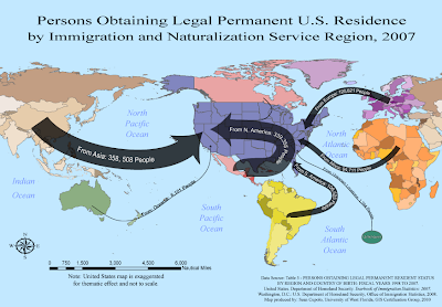
How to describe the Flow Mapping experience ... to paraphrase from the words of Sheldon Cooper from the TV show, The Big Bang Theory, whilst he was paraphrasing Khan from the movie, Star Trek II: The Wrath of Khan, in reference to the actor Will Wheaton .... it tasked me.
I started this map on Tuesday and am finishing it on Sunday, I did not work on it every day but spent a considerable amount of time trying to deal with the particulars of showing the flows in the way I wanted to present them. I had worked out a sketch on Tuesday for the theme and was very happy with it. However, it involved centering the United States within the map. In Arc I used the suggested projection after looking at a couple of others because I thought I could work with it, but when I got to Illustrator, I had lots of problems making things look the way I wanted. First to center the U.S. required cutting Asia in half and then grouping all the elements in Asia that needed to be moved. That task alone was several hours worth of work because there were so many individual objects and long moments were spent just waiting for the objects to be moved up the layer panel so they could be grouped. I got better toward the end, turning off the new layer so objects disappeared and sub-grouping objects in the original layer to try to shorten the list, but it would seem that there has got to be an easier way to do what I wanted and I'll seek advice from the instructor, Trisha, on a better method.
I also felt the map would look better if I colored individual countries in a region with a different shade of a particular color, rather then having one uniform color for the whole region. Shades allow the user to keep the whole region as a unit in mind while at the same time hinting that the data does come from individual countries after all. Doing so was not too hard but again, because there were so many objects, it was a time consuming task, especially trying to decide which shade to U.S. In the end I'm fairly happy with the way it looks, but not sure it was worth all the effort.
Once I got the U.S. centered, I wanted to expand it in a way that was thematically pleasing and made the U.S. the focal point of the map but did not want to distort the general map layout much to preserve the sense of spacial distance that people would travel to permanently move to the U.S. Again this proved to be more difficult then I'd expected, but I am somewhat happy with the result. I had my wife look at the map and she did not immediately focus on the fact that the U.S. was out of scale nor felt if detracted from the map, so I think that thematic idea worked.
Lastly, I did not want to bother with a legend on this map because there did not seem to be enough legend worthy information. I felt it'd be possible to incorporate the immigration data within each flow line. This also gave me a chance to play with placing text on a path, something I had not worked with in the previous typography lab. Again, it was difficult to get everything the way I wanted - drawing the lines, placing and sizing the text, centering the text on the line. I had to draw the line, place, adjust and center the text, then add the point size for the line and the arrow head, then adjust as needed. In the end I am very pleased with how this part of the map turned out and once I learned the steps was able to add each flow-line without incident.
I am pleased with what I finally achieved because the map does work thematically.

How to describe the Flow Mapping experience ... to paraphrase from the words of Sheldon Cooper from the TV show, The Big Bang Theory, whilst he was paraphrasing Khan from the movie, Star Trek II: The Wrath of Khan, in reference to the actor Will Wheaton .... it tasked me.
I started this map on Tuesday and am finishing it on Sunday, I did not work on it every day but spent a considerable amount of time trying to deal with the particulars of showing the flows in the way I wanted to present them. I had worked out a sketch on Tuesday for the theme and was very happy with it. However, it involved centering the United States within the map. In Arc I used the suggested projection after looking at a couple of others because I thought I could work with it, but when I got to Illustrator, I had lots of problems making things look the way I wanted. First to center the U.S. required cutting Asia in half and then grouping all the elements in Asia that needed to be moved. That task alone was several hours worth of work because there were so many individual objects and long moments were spent just waiting for the objects to be moved up the layer panel so they could be grouped. I got better toward the end, turning off the new layer so objects disappeared and sub-grouping objects in the original layer to try to shorten the list, but it would seem that there has got to be an easier way to do what I wanted and I'll seek advice from the instructor, Trisha, on a better method.
I also felt the map would look better if I colored individual countries in a region with a different shade of a particular color, rather then having one uniform color for the whole region. Shades allow the user to keep the whole region as a unit in mind while at the same time hinting that the data does come from individual countries after all. Doing so was not too hard but again, because there were so many objects, it was a time consuming task, especially trying to decide which shade to U.S. In the end I'm fairly happy with the way it looks, but not sure it was worth all the effort.
Once I got the U.S. centered, I wanted to expand it in a way that was thematically pleasing and made the U.S. the focal point of the map but did not want to distort the general map layout much to preserve the sense of spacial distance that people would travel to permanently move to the U.S. Again this proved to be more difficult then I'd expected, but I am somewhat happy with the result. I had my wife look at the map and she did not immediately focus on the fact that the U.S. was out of scale nor felt if detracted from the map, so I think that thematic idea worked.
Lastly, I did not want to bother with a legend on this map because there did not seem to be enough legend worthy information. I felt it'd be possible to incorporate the immigration data within each flow line. This also gave me a chance to play with placing text on a path, something I had not worked with in the previous typography lab. Again, it was difficult to get everything the way I wanted - drawing the lines, placing and sizing the text, centering the text on the line. I had to draw the line, place, adjust and center the text, then add the point size for the line and the arrow head, then adjust as needed. In the end I am very pleased with how this part of the map turned out and once I learned the steps was able to add each flow-line without incident.
I am pleased with what I finally achieved because the map does work thematically.
Wednesday, March 10, 2010
Week 8 Dot Distribution Maps
The displayed map was created as part of the University of West Florida Online GIS Certification program class, Cartographic Skills, (GIS 3015/L) for the Week 8 lab exercise: Dot Maps. The map was created using Adobe Illustrator to add the dots to a preloaded map of Florida counties.
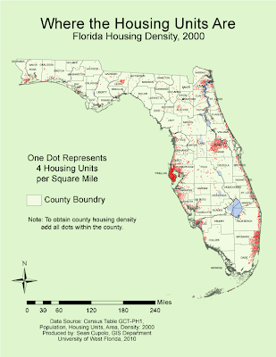
Maybe spring break got me a little off my game, but the lab seemed very confusing to me, particularly the issue of whether to use dots that represent a raw data unit or a density unit. I used the density unit after following class discussions as a means to try to adhere to the original instructions. Adding dots was a time consuming process though not actually that difficult.
Most of the dots were added dot-by-dot because I tried to place dots relative to the way the actual population might be distributed. For example, dots were clustered around large cities such as Orlando and Tallahassee then outlier dots would be placed in locations of other smaller towns in the county. In counties with lower population densities, a dot would be placed proximate to where each town was located and additional dots would be dispersed within proximity to whichever towns may have a larger population. Geographic feature layers such as marsh and water were used to limit the placement dots to suitable housing areas and a geographically weighted approach was used when placing dots in a county adjacent to a more densely populated one. For dot size I chose a size of 0.75 point which seemed to allow coalescing in the densest county, Pinellas, but was still easily distinguishable in counties with lower densities.
It was very helpful to use the filtering feature in Excel to select each county as I worked on it since the Excel table was in alphabetical order. In general, after adding all the dots for Pinellas and setting my dot size and dot value, I worked the map from Northwest to Southeast going county by county. Wikipedia was found to be very helpful for the task because it was hard to see some of the county borders and I had to adjust several of the border labels as well. Each county can be looked up in Wikipedia simply by searching for it and each county entry has an inset map of Florida with the county highlighted. I really didn't have to use the layering and grouping features much for the lab, though the compass and scale bar were grouped as objects to make them easier to move and adjust. The scaling feature really helped a lot as I had not known how to scale mathematically prior to the lab and was trying to use the scaling tool, a dicey proposition at times.

Maybe spring break got me a little off my game, but the lab seemed very confusing to me, particularly the issue of whether to use dots that represent a raw data unit or a density unit. I used the density unit after following class discussions as a means to try to adhere to the original instructions. Adding dots was a time consuming process though not actually that difficult.
Most of the dots were added dot-by-dot because I tried to place dots relative to the way the actual population might be distributed. For example, dots were clustered around large cities such as Orlando and Tallahassee then outlier dots would be placed in locations of other smaller towns in the county. In counties with lower population densities, a dot would be placed proximate to where each town was located and additional dots would be dispersed within proximity to whichever towns may have a larger population. Geographic feature layers such as marsh and water were used to limit the placement dots to suitable housing areas and a geographically weighted approach was used when placing dots in a county adjacent to a more densely populated one. For dot size I chose a size of 0.75 point which seemed to allow coalescing in the densest county, Pinellas, but was still easily distinguishable in counties with lower densities.
It was very helpful to use the filtering feature in Excel to select each county as I worked on it since the Excel table was in alphabetical order. In general, after adding all the dots for Pinellas and setting my dot size and dot value, I worked the map from Northwest to Southeast going county by county. Wikipedia was found to be very helpful for the task because it was hard to see some of the county borders and I had to adjust several of the border labels as well. Each county can be looked up in Wikipedia simply by searching for it and each county entry has an inset map of Florida with the county highlighted. I really didn't have to use the layering and grouping features much for the lab, though the compass and scale bar were grouped as objects to make them easier to move and adjust. The scaling feature really helped a lot as I had not known how to scale mathematically prior to the lab and was trying to use the scaling tool, a dicey proposition at times.
Sunday, February 28, 2010
Week 7 - Proportional Symbol Maps
The displayed map was created as part of the University of West Florida Online GIS Certification program class, Cartographic Skills, (GIS 3015/L) for the Week 7 lab exercise: Proportional Symbol Maps. The map was generated using GIS ArcMap software and then exported to Adobe Illustrator for finishing and adding the proportional circles.

I decided to try something different this time by making the mapped area white and the background gray in hopes that it would add figure-ground appeal. I didn't like how the map first looked with black borders so the border was lightened several shades. When I started adding my proportional circles, I intended to use opaque black circles thinking they'd stand out really well. However, using opaque circles presented a problem in that a lot of the countries were very small and also I felt it was important to try to preserve the country labels since that information would be useful to a map reader. Placing some of the larger circles, such as for Italy and France, sealed the deal because so much of the border was wiped out by the symbol and I did not like the way it looked. So I changed the symbol to dark gray and then set a transparency so borders and labels could be seen. In the end I chose a transparency level of 90% opaqueness which is almost full opaqueness but seems to retain the ability to see the necessary information. I also moved a lot of the country labels to places where they could more easily be read adding leader lines as needed. I did add the amount for Germany to my map although I'm not sure we were supposed to. For the one country that I found that was not a wine producing country I shaded the entire country with a 50% white to black gradient which allows it to stand out but not overwhelm the other parts of the map.
For the legend I chose to create a set of six symbols based on applying something close to the optimal method for choosing the first 5 symbols and then adding a sith in the large gap between two symbols.
Creating the circles and getting them into position and working them in with the labels was time consuming and painstaking as was creating the legend.

I decided to try something different this time by making the mapped area white and the background gray in hopes that it would add figure-ground appeal. I didn't like how the map first looked with black borders so the border was lightened several shades. When I started adding my proportional circles, I intended to use opaque black circles thinking they'd stand out really well. However, using opaque circles presented a problem in that a lot of the countries were very small and also I felt it was important to try to preserve the country labels since that information would be useful to a map reader. Placing some of the larger circles, such as for Italy and France, sealed the deal because so much of the border was wiped out by the symbol and I did not like the way it looked. So I changed the symbol to dark gray and then set a transparency so borders and labels could be seen. In the end I chose a transparency level of 90% opaqueness which is almost full opaqueness but seems to retain the ability to see the necessary information. I also moved a lot of the country labels to places where they could more easily be read adding leader lines as needed. I did add the amount for Germany to my map although I'm not sure we were supposed to. For the one country that I found that was not a wine producing country I shaded the entire country with a 50% white to black gradient which allows it to stand out but not overwhelm the other parts of the map.
For the legend I chose to create a set of six symbols based on applying something close to the optimal method for choosing the first 5 symbols and then adding a sith in the large gap between two symbols.
Creating the circles and getting them into position and working them in with the labels was time consuming and painstaking as was creating the legend.
Monday, February 22, 2010
Module 6 - Choropleth Mapping
The posted maps were completed as part of the Week 6 lab for the University of West Florida Online GIS Certification program class, Cartographic Skills (GIS 3015/L), and demonstrate techniques in choropleth mapping.
Color Choropleth Map
The first map is a color choropleth showing the population change by state for the United States from April 1, 1990 to April 1, 2000. The map was generated using ArcMAP and exported for finishing in Abobe Illustrator (CS4).
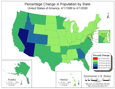
Generating the map in ArcMap was fairly straightforward process. I actually created 4 data frames to get the Alaska, Hawaii and DC insets. I used a contrasting red for the negative population growth, not realizing only DC was going to show that number. Probably could have avoided doing so, but I thought that was an interesting thing to highlight. I tried to use the Color Brewer web site but found the light color not to my liking for the map because too many border states were light and seemed to fade into the background.
Black and White Choropleth
The next map is another choropleth showing population change, however this time by U.S. Census Divisions. The idea was to take the first choropleth map and alter it in Adobe Illustrator to create a new map with new information, divisions and such.
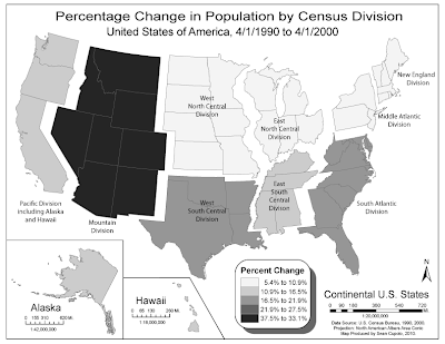
Creating the map was actually pretty fun though somewhat painstaking. The project first required running calculations from the state population data to obtain division data. I used Excel for the task printing out my work and it helped me organize the ideas for how I would display the map and make sure I selected the correct states for each division.
Color Choropleth Map
The first map is a color choropleth showing the population change by state for the United States from April 1, 1990 to April 1, 2000. The map was generated using ArcMAP and exported for finishing in Abobe Illustrator (CS4).

Generating the map in ArcMap was fairly straightforward process. I actually created 4 data frames to get the Alaska, Hawaii and DC insets. I used a contrasting red for the negative population growth, not realizing only DC was going to show that number. Probably could have avoided doing so, but I thought that was an interesting thing to highlight. I tried to use the Color Brewer web site but found the light color not to my liking for the map because too many border states were light and seemed to fade into the background.
Black and White Choropleth
The next map is another choropleth showing population change, however this time by U.S. Census Divisions. The idea was to take the first choropleth map and alter it in Adobe Illustrator to create a new map with new information, divisions and such.

Creating the map was actually pretty fun though somewhat painstaking. The project first required running calculations from the state population data to obtain division data. I used Excel for the task printing out my work and it helped me organize the ideas for how I would display the map and make sure I selected the correct states for each division.
Knowing that the map would be gray-scale, I wanted to try to create a visual separation on the divisions and decided to "float" them away from each other. Since this is a thematic map, I feel that doing so is acceptable because of the visual effect it adds to the thematic goal of the map. However, in order to be able to move a division, I had to group all the states in the division into one group layer to make it easier to select a division, adjust it's position then select another division. Grouping also made coloring the states a snap as I could just select the group and hit the swatch color for that class which I set up beforehand. Trisha, thanks for reminding us to re-watch that Abode tutorial on Layers and Groups it helped immensely.
Al in all I'm pretty happy with both maps.
Subscribe to:
Posts (Atom)