Color Choropleth Map
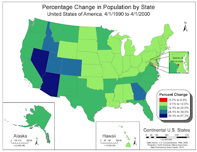
The first map is a color choropleth showing the population change by state for the United States from April 1, 1990 to April 1, 2000. The map was generated using ArcMAP and exported for finishing in Abobe Illustrator (CS4).

Generating the map in ArcMap was fairly straightforward process. I actually created 4 data frames to get the Alaska, Hawaii and DC insets. I used a contrasting red for the negative population growth, not realizing only DC was going to show that number. Probably could have avoided doing so, but I thought that was an interesting thing to highlight. I tried to use the Color Brewer web site but found the light color not to my liking for the map because too many border states were light and seemed to fade into the background.
Black and White Choropleth
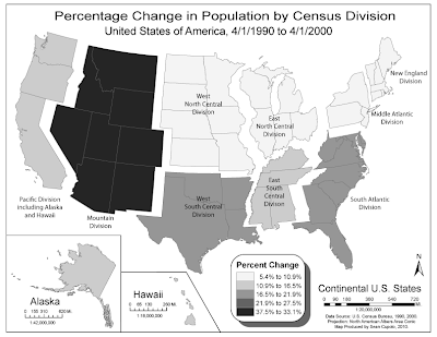
The next map is another choropleth showing population change, however this time by U.S. Census Divisions. The idea was to take the first choropleth map and alter it in Adobe Illustrator to create a new map with new information, divisions and such.

Creating the map was actually pretty fun though somewhat painstaking. The project first required running calculations from the state population data to obtain division data. I used Excel for the task printing out my work and it helped me organize the ideas for how I would display the map and make sure I selected the correct states for each division.
Knowing that the map would be gray-scale, I wanted to try to create a visual separation on the divisions and decided to "float" them away from each other. Since this is a thematic map, I feel that doing so is acceptable because of the visual effect it adds to the thematic goal of the map. However, in order to be able to move a division, I had to group all the states in the division into one group layer to make it easier to select a division, adjust it's position then select another division. Grouping also made coloring the states a snap as I could just select the group and hit the swatch color for that class which I set up beforehand. Trisha, thanks for reminding us to re-watch that Abode tutorial on Layers and Groups it helped immensely.
Al in all I'm pretty happy with both maps.

You certainly set the bar high. Nice work Sean.
ReplyDeleteSean, good thinking on the negative value for DC - I didn't about showing that. Your blow-up looks much nicer than mine - I tried to keep control of the groups but managed to lose control quickly - much like my driving!
ReplyDeleteNICE MAPS! I floated my divisions as well. I wanted to outline them so I could show the different divisions but I could not figure it out. So I decided to seperate them. I like your inset for you legend. I agree with Lynn.
ReplyDeleteVery nice work!!! Both Arc and Ai were done well. (Although a not to scale designation for Ak and Hi would have worked to save some time!)
ReplyDeleteAnd AI is all about layers and groups...once you figure that out you can do some pretty neat things. Curious to see your wine map next :)