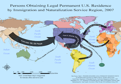
The displayed map was created as part of the University of West Florida Online GIS Certification program class, Cartographic Skills, (GIS 3015/L) for the Week 9 lab exercise: Flow Maps. The map was generated using ESRI ArcGIS - ArcMap and then exported to Adobe Illustrator (CS4) for editing and thematic elements.
How to describe the Flow Mapping experience ... to paraphrase from the words of Sheldon Cooper from the TV show,
The Big Bang Theory, whilst he was paraphrasing Khan from the movie,
Star Trek II: The Wrath of Khan, in reference to the actor Will Wheaton .... it tasked me.
I started this map on Tuesday and am finishing it on Sunday, I did not work on it every day but spent a considerable amount of time trying to deal with the particulars of showing the flows in the way I wanted to present them. I had worked out a sketch on Tuesday for the theme and was very happy with it. However, it involved centering the United States within the map. In Arc I used the suggested projection after looking at a couple of others because I thought I could work with it, but when I got to Illustrator, I had lots of problems making things look the way I wanted. First to center the U.S. required cutting Asia in half and then grouping all the elements in Asia that needed to be moved. That task alone was several hours worth of work because there were so many individual objects and long moments were spent just waiting for the objects to be moved up the layer panel so they could be grouped. I got better toward the end, turning off the new layer so objects disappeared and sub-grouping objects in the original layer to try to shorten the list, but it would seem that there has got to be an easier way to do what I wanted and I'll seek advice from the instructor, Trisha, on a better method.
I also felt the map would look better if I colored individual countries in a region with a different shade of a particular color, rather then having one uniform color for the whole region. Shades allow the user to keep the whole region as a unit in mind while at the same time hinting that the data does come from individual countries after all. Doing so was not too hard but again, because there were so many objects, it was a time consuming task, especially trying to decide which shade to U.S. In the end I'm fairly happy with the way it looks, but not sure it was worth all the effort.
Once I got the U.S. centered, I wanted to expand it in a way that was thematically pleasing and made the U.S. the focal point of the map but did not want to distort the general map layout much to preserve the sense of spacial distance that people would travel to permanently move to the U.S. Again this proved to be more difficult then I'd expected, but I am somewhat happy with the result. I had my wife look at the map and she did not immediately focus on the fact that the U.S. was out of scale nor felt if detracted from the map, so I think that thematic idea worked.
Lastly, I did not want to bother with a legend on this map because there did not seem to be enough legend worthy information. I felt it'd be possible to incorporate the immigration data within each flow line. This also gave me a chance to play with placing text on a path, something I had not worked with in the previous typography lab. Again, it was difficult to get everything the way I wanted - drawing the lines, placing and sizing the text, centering the text on the line. I had to draw the line, place, adjust and center the text, then add the point size for the line and the arrow head, then adjust as needed. In the end I am very pleased with how this part of the map turned out and once I learned the steps was able to add each flow-line without incident.
I am pleased with what I finally achieved because the map does work thematically.