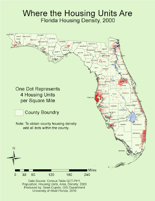
Maybe spring break got me a little off my game, but the lab seemed very confusing to me, particularly the issue of whether to use dots that represent a raw data unit or a density unit. I used the density unit after following class discussions as a means to try to adhere to the original instructions. Adding dots was a time consuming process though not actually that difficult.
Most of the dots were added dot-by-dot because I tried to place dots relative to the way the actual population might be distributed. For example, dots were clustered around large cities such as Orlando and Tallahassee then outlier dots would be placed in locations of other smaller towns in the county. In counties with lower population densities, a dot would be placed proximate to where each town was located and additional dots would be dispersed within proximity to whichever towns may have a larger population. Geographic feature layers such as marsh and water were used to limit the placement dots to suitable housing areas and a geographically weighted approach was used when placing dots in a county adjacent to a more densely populated one. For dot size I chose a size of 0.75 point which seemed to allow coalescing in the densest county, Pinellas, but was still easily distinguishable in counties with lower densities.
It was very helpful to use the filtering feature in Excel to select each county as I worked on it since the Excel table was in alphabetical order. In general, after adding all the dots for Pinellas and setting my dot size and dot value, I worked the map from Northwest to Southeast going county by county. Wikipedia was found to be very helpful for the task because it was hard to see some of the county borders and I had to adjust several of the border labels as well. Each county can be looked up in Wikipedia simply by searching for it and each county entry has an inset map of Florida with the county highlighted. I really didn't have to use the layering and grouping features much for the lab, though the compass and scale bar were grouped as objects to make them easier to move and adjust. The scaling feature really helped a lot as I had not known how to scale mathematically prior to the lab and was trying to use the scaling tool, a dicey proposition at times.

No comments:
Post a Comment