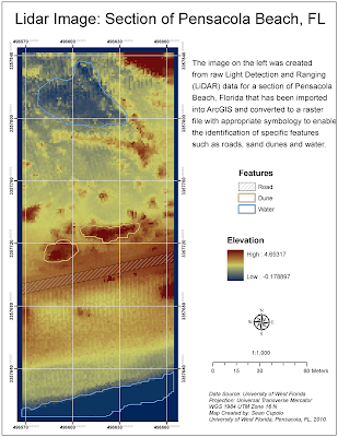
The map image below was created using ArcGIS with Light Detection and Ranging (LiDAR) data collected from an airplane over a section of Pensacola Beach, Florida. The image was created for the Week 5 LiDAR Module Challenge in the 2010 University of West Florida Online GIS Certification program class, Photo Interpretation and Remote Sensing (GIS 4035L).
To create the image, the LiDAR data was converted into a point file using the Add XY Data tool in ArcGIS and then exported as a shape-file which was then converted to a raster file using the IDW Spatial Analyst tool. The rater image was given a stretched symbology to enable the identification of features and then symbolized using color scheme showing contrasting colors for low to high elevations, in this case darker blue tones for the lower elevations and orange-red for the higher elevations. The contrasting tones contribute to the ability to identify features of which there where three types we were asked to highlight - a road, sand dunes and water. To show these features, a new polygon layer was added and each feature was outlined in the polygon layer and then symbolized separately after adding a feature identification field to the polygon layer. The map was then laid out with a grid to show the projection system used for the original LiDAR data set.
Everything seemed to go pretty smoothly for the challenge, the biggest issue being deciding how to add a header to the original dataset to make sure ArcMap could identify the X, Y and Z columns. The ID polygons took some time to get correct but only because I kept closing them too soon and had to redo them.

Sunday, July 25, 2010
Monday, July 19, 2010
Module 4 Challenge: Supervised Classification
The link posted here is to a map created using ERDAS IMAGINE 2010 software as part of the University of West Florida On-line GIS Certification program class, Photo Interpretation and Remote Sensing (GIS4035/L). The link requires Internet Explorer to open and display properly.
Germantown Maryland
The image is a Supervised Maximum Likelihood classification from a satellite image of Germantown, Maryland classified for 14 land use types identified by spectral signatures identified using the ERDAS IMAGINE software. The process involved creating a unique spectral signature for each land use type by first creating an area of interest polygon around a specific known feature on the map in an attempt to capture pixel values that are unique to the feature and thus to the type of land use. Once the distinct signatures were created the software could reclassify the entire image using the signatures to show each of the land use type.
In theory the task was not too complicated. However, knowing when a specific signature covered enough pixels in the image was not an easy task, particularly after the assignment was changed to require that each land use contain pixel values in a certain range. In the end I got 12 of 14 within the proper ranges and was only off on the other two by a relatively small amount of pixels. However, after reclassifying signatures multiple times and regenerating the classified map 16 times, I feel I gave a tremendous effort to accomplish a task that just did not seem worthwhile as each successive classification once a certain point had been reached seemed to have a negligible effect on the image as a whole. In that respect I'm satisfied with the map regardless off the possible mark downs for these two classes that were only slightly out of the challenge parameters.
Monday, July 12, 2010
Module 3: Rectification Challenge
The link posted here is to a map created using ERDAS IMAGINE 2010 software as part of the University of West Florida On-line GIS Certification program class, Photo Interpretation and Remote Sensing (GIS4035/L). The link requires Internet Explorer to open and display properly.
The image is a rectified Landsat ETM+ satellite image of downtown Pensacola, Florida. Rectification is the process of making an image conform to a specific known projection system by referencing map coordinates on the image to a known source set of coordinates from an existing map or other resource, a process called georeferencing. In the challenge assignment, students had to georeference locations in the satellite image to like locations from a USGS topographic reference map. The process requires locating similar features on both maps and using ERDAS Imagine's Multipoint Geometric Correction workspace to place Geographic Control Points (GCPs) on both maps that the software can use to determine how accurate the reference is. The software does so by calculating a type of error called the Root Mean Square Error(RMSE) for each of the points. The lower the error can be made for each point, the more accurate the re projection of the image is. In our case, we were required to place at least seven control points with a total average error below 1.0; essentially within 1 Pixel value in the satellite image. I placed eight control points on the map and had a total average RMSE of 0.255 and a Total Control Point Error value of 0.3034.
Landsat ETM Image of Downtown Pensacola
I thought this was a fun lab. It is similar to an exercise we did with ArcGIS in Intro to GIS last semester but the level of error required was much much lower. However, I found that it wasn't too difficult to lower your error values after some trial and error experimentation with the software. Basically, you need to place a point in an identifiable location in the topographic map, then place the same point in the image and check what the error is. Once you have the value, blow the image up to an extreme size where each pixel can be seen distinctly. At that point you can move your control point on the satellite image and using the on-the fly RMSE values that change with each move essentially home in on where the point should actually be located. I think with a little practice I could get my RMSE below 0.1 if needed.
Monday, July 5, 2010
Module 2: Spectral Band Basics
The links posted here are to maps created using ERDAS IMAGINE 2010 software as part of the University of West Florida On-line GIS Certification program class, Photo Interpretation and Remote Sensing (GIS4035/L). The links require Internet Explorer to open and display properly.
The goal of the assignment was to use reflectance characteristics of known features in a satellite photo and different spectral band combinations measured by LANDSAT Thematic Mapper to identify said features. The first feature identified is water which has a very high absorbance for infrared radiation (IR) and so appears darker in infrared images. The second map shows a glacier which is somewhat the opposite of the water, reflecting much of the radiation in the lower visible and infrared layers. The last image shows an area of shallow water where the bottom can be seen in the image and is actually reflecting more IR radiation then deeper water would. Such situations can make it difficult to properly discern where features begin and end.
Map 1 - Water Feature
Map 2 - Glacier Feature
Map 3 - Shallow Water Feature
The lab was very interesting. I experimented with all the bands as can be seen in the images which are each set to different color combinations. For the glacier I actually used a combination labeled for Desert details but felt it was a better contrasting image then the plain IR. I did have some issues getting the map images together in remembering how to do it from last weeks labs but by the third map I had become pretty efficient. I could not figure out how to make a map template and will look further into doing so, as it does seem to save a little time.
Subscribe to:
Posts (Atom)